Nonna’s Creamery
↓ The Opportunity
Nonna’s Creamery, a new gelato brand based in Delhi, was preparing to launch on Indian grocery delivery apps. They needed packaging that stood out in a competitive market—something playful and personal, yet cost-effective for small-batch production.
↓ My Role
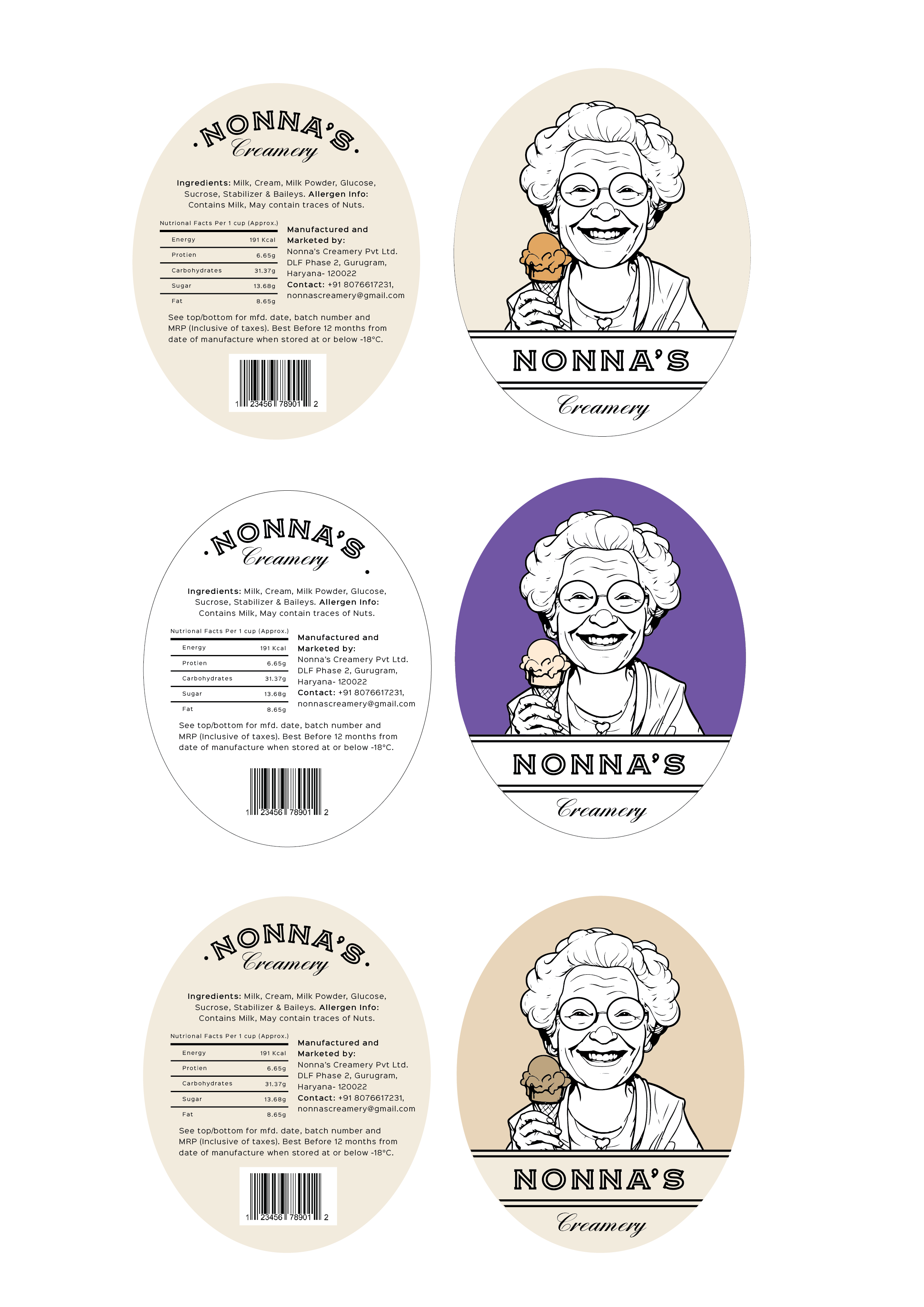
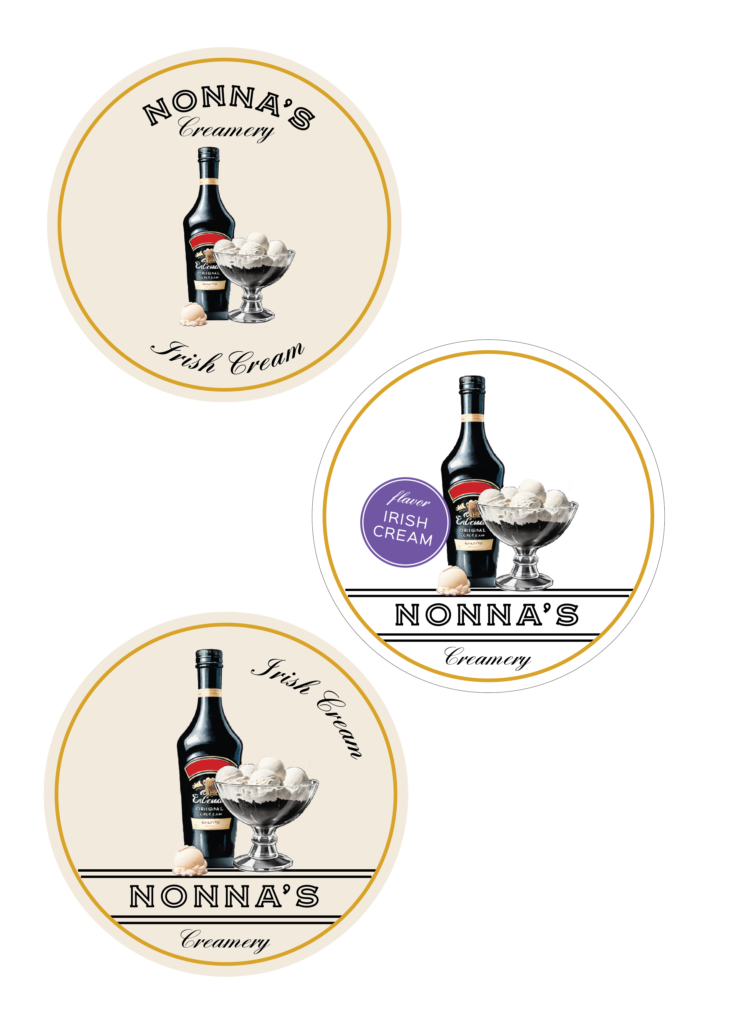
I led the packaging design, developing a sticker-based system featuring illustrated flavor cues and a warm, approachable “Nonna” mascot. The goal was to balance charm with practicality, giving the brand a recognizable shelf presence without requiring custom-printed containers.
↓Business Impact
The flexible sticker system allowed for quick scaling across seasonal flavors and small-batch runs. The brand’s visual identity helped it connect with urban buyers looking for artisanal, locally-made treats, positioning Nonna’s as both premium and approachable.
↓ Next Steps & Success Metrics
As the product rolled out, we tracked engagement through early customer reviews and packaging performance in delivery settings. Future plans included expanding the system for gift boxes, pop-up carts, and in-store POS displays.